Pages

Tuesday, April 28, 2015

When Iconic Creatures become Design Inspiration

A couple of years ago an interior designer contacted us to design some custom cabinet pulls for her client's kitchen. Typically a designer will fill us in all the details about the room including cabinets, floors, tiles, wall coverings, appliances, etc,  This helps us figure out the best way to approach the design of the handle.

But instead of enumerating all the elements in the decor, she told me that her inspiration was the peacock and sent me several pictures, including photos, paintings and drawings of this fabulous bird of all birds.
Then to add a little excitement to the project she wanted a variety among the 50 pulls and posed that we create several design and color combinations.

So I went to town on this one putting together a palette of turquoise, lapis,emerald and periwinkle with gold paint finishes and gold metal details.

Swarovski crystals in olivine, amethyst and topaz were the finishing touch.

Too bad I never saw the finished kitchen with pulls installed. But I took some photos before we shipped them and well-- I couldn't help creating a Ziegfield-esque formation of the peacock out of our pulls. It was fun. And the best part- a customer just recently saw my photo on houzz.com and requested the same custom pulls for living room built-ins..Hope to see a photo of her finished project!

Sunday, April 12, 2015

My Favorite Shades of Gray


An awesome pairing with our moonstone gray paint finishes,
the pewter gray silk lamp shade adds a soft and quiet glow.


A Broad Spectrum for Every Taste

Gray is a color with diverse personalities; masculine (prominent in the male wardrobe), modern (shiny metallic) and neutral (halfway between black and white). It can feel the concrete and steel of urban culture or the subtle charm of weathered wood.

The dictionary defines it as dull or non descript without interest or character; colorless or unremarkable.  Wow! That's hardly the way we can describe this color in the decorating realm where it plays a key role in many a design scheme.
   Is gray the new white?  A new direction in kitchen cabinets with finishes that 
   vary from metallic to distressed is a hot trend with staying power.

Unlike black and white that offer high contrast and definition - gray tends to mute or quiet the color scheme while allowing us to focus on the more lively accents and neighboring colors.
.
I noticed that gray definitely had a huge presence in both the 2015 Kitchen and Bath Industry show and the World Furniture Market.  Cabinetry, metallic finishes, tiles, textiles, as well as case goods and upholstered furnishings all made great use of the many shades of gray.

Call it charcoal, gunmetal, smokey. the prominent shade of gray in our line is a jewel tone hue that we call moonstone. It pops up a lot in our decorative cabinet and drapery hardware because I especially like the way it works with silver metal details and diamond like crystals. The look is sharp, contemporary and easily incorporated into kitchen and bath decor with nickel and chrome fixtures.

    Mini Duo  knob 2" diameter and Nu Duo knob 1.5" diameter in
    deep lapis and moonstone. Silver metal and brilliant crystal details 
    offer a contemporary and modern flair.
Nu Carnival Knob in light gold has
scrolly artwork in  moonstone.
 Duchess Orbit pull and Nu Duchess knob in turquoise and moonstone.
show an emphasis on silver metal and silver paint finishes 
  Grand Tiki knob in ruby and moonstone is used as the finial end 
   piece on a drapery rod with silver paint finish  1 3/4" diameter.

      
          Tut Window Decor Set in ruby, moonstone.and silver paint 
          treatment makes a strong color statement with vibrant red and 
          shades of gray.
         

Sunday, March 8, 2015

Hooray for Kid's Stuff!


It should come as no surprise that our decorative cabinet and drapery hardware are a hit with children's room decor. You can't be too whimsical, too colorful or too playful. Just release your inner child and have some decorating fun.

Mix the styles. Mix the colors. Mix the sizes

That''s how one of our customers designed her children's playroom. She dressed up her Ikea laminated cabinetry with 3 different Susan Goldstick cabinet knobs. I especially like the way she chose knobs that all have a silver painted stem or base. It  shows a nice contrast and profile..


I

Interior Designer Linda Mansy of McIntyre-Mansy Associates created unusual window treatments with our Birdie drapery finials and brackets. She has a fantastic eye for color and takes whimsy to the max! These are very lucky little girls. 


I  absolutely love how she divided the windows, running the decorative drapery rods at eye level. The perfect way to show off our unique and colorful Birdie finials.
The fabric wrapped poles with the feathery fringe adds extra whimsy and fanciful flair. The lively aqua  walls are a great backdrop for our ruby colored  Birdie finials with silver metal details and paint finish. 

Close up of the  window treatment shows Birdie finial and bracket created in custom paint colors,
 just one of the many well thought out details in this spectacular little girl's room.

Birdie Finial in Copper Aqua with bracket in matching paint finish is the decorative hardware 
selected for little Kendall's room.. 

Monday, January 26, 2015

KBIS 2015 - The Buzz on Cabinet Trends in Kitchen and Bath


My souvenir - A little fun in the Moen booth  let you create your very own ebru print. 


Packed with a crowd anxious to see all that's new on the kitchen and bath scene, the show was vibrant and healthy this year. If I were to single out the one trend that was a stand out,
I have to say that blended textures was a key design element that had a starring role.

Whether it was tiles, cabinets, faucets, counter surfaces- everything was beckoning to be touched.


Rugged meets City Slicker

Cabinetry took a departure from the simple shaker style and I saw a lot of intricate paneling with recesses and multiple layers of moldings and trim.  I was particularly drawn to the juxtaposition of old weathered wood finishes paired with shiny metallic mesh paneling. Not your typical cherry and bamboo but oak, pine, alder, woods of every kind were treated to a fashionable stain, gloss or rub and they all looked amazing.

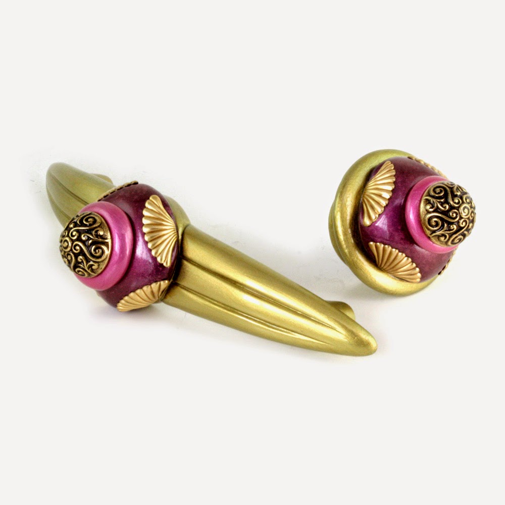
Recessed cabinet panels got the full treatment in everything from lattice laminates, wire mesh and fabric. The emphasis was on the center panel. I noticed much of the raised trim was fairly narrow leaving little space for bulky hardware. Knobs and pulls were scaled down and linear shapes were popular as well as creative placement. I'm already thinking about some new mini handle designs and plan to expand our petit collection of  knobs 1" diameter.


No pun intended, but 50 shades of gray was the most stand out color. Gun metal, clay, slate, putty.. it was embraced in every exhibit.  Typically seen with silver or chrome accents, I noticed that gray was also often paired with warmer golds and brown tones that gave it a new and edgy flair.

Formica took a bold leap with Jonathan Adler's colorful laminates that emulated fabric patterns. I had a little fun selecting our knobs and pulls to match. Imagine these laminates in a recessed cabinet panel with white trim.

Jonathan Adler Formica laminates with Susan Goldstick hardware from top left clockwise:
Nu Tiki Light Sapphire knob, Eel style 6 copper pull, Petit Square3 lapis knob, Petit 6 emerald knob

Tuesday, December 23, 2014

Quiet Red

 It's almost an oxymoron of sorts, Passion, heat and warning are all intense associations with red. So how do we quiet it down? You have to add a little brown or a complementary color to the mix to arrive at a subdued shade.
And that's what we'll see in the stores next year. Marsala is the chosen Pantone color for 2015. Rich, deep and earthy, it will be a fave in every venue from nail salons to the runways.

This elegant hue has a special place in home decor that captures the mood of seasonal color schemes. Put it with golds and oranges and you get an autumn palette or layer it with hunter green to feel the spirit of winter, Combine it with pale pinks and pastels to bring on the lightness of spring or step into the summer heat and match it up with a hot lipstick red.

.
I'm generally not drawn to monochromatic color schemes but the paint treatment on the Poppy lamp is a winner for me. The artwork uses a soft reddish brown combined with a bright rouge red and pale blush. Silver metal details and the poinsettia silk shade give it that extra oomph! 


Add the presence of a bronze green or pearly white as we did in these square knob prototypes. Both color combos are popular and easily integrated into interior decorating themes.
Cherry wood with a reddish stain, white cabinetry, or even black would be a fantastic backdrop for these little treasures. Gold metal details and smoke topaz crystals are a pretty sweet accent with wood flooring.


The 36" Aurora mirror frame is a display of our jewel tone ruby and agate brown paint treatment. The illusion of the two colors side by side fools the eye to read a marsala red.


In keeping with the theme of our jewel-tone names, our marsala hue will be coined light  garnet. Hardly a "quiet" red, this is bound to be a big color for our line in 2015.


Sunday, November 30, 2014

Pink -- When It's Hot, It's Hot!


So easily associated with little girls, valentines and summer wardrobe, pink can take on a whole different persona when it comes to decorating.
It probably had it's heyday in the art deco period when pink and black tiles were the fashion for bathrooms.


The color also had a huge presence in mid century modern furnishings. My childhood memories bring up recollections of our living room where the focus was a pair of glamorous club chairs. They were covered in a pale pink leather outlined with nail head details and paired with a couch in a handsome gray tweed. Wish I had a photo! But nevertheless I resurrected the color scheme in the paint finish for our Posh Pam lamp with a silk shade in a vibrant blush.


A few years back  I was determined to create a new and  uncommon color scheme for the High Point Furniture Show. We showed up at market with our Neapolitan collection that included a Diva armoire and Rumba end table painted in a rosy pink and brown motif .

To complete the vinette we also introduced our Rockin Rose lamp. The shade was a modern hardback drum shape covered with a brown poly blended fabric. I had it lined and trimmed with the same fabric in dusty pink. When the lamp was turned on the glow was an awesome cinnamon.red.


For the moment I'm on a mission to find a spot for hot pink in our collections and exploring new ways to use it n our hardware. For the start, I'm loving it with bronze green, amethyst purple and gold. Where it leads me...we'll just have to see.

Thursday, November 20, 2014

Hand Painting - It Gets Personal

I was reminded recently of how I came up with our Tiki designs. Originally created to mimic tortoise shell shapes and colors inspired by the tortie coat of  my Persian cat Lucy, I never expected it to become one of our most popular lines.  I've watched it morph over the years as each artist in my workshop put in their own personal interpretation of "Tiki". Just like handwriting, each Tiki knob and finial adopted a signature look.

Tiki Banister Ball has a magnificent blend of  black  butterscotch and gold just like my  Persian cat Lucy, 
.Then we even started to create the pattern in colors far removed  from the original tortoise pattern. Purples, blues, reds and most recently pink and blue. I almost forgot there was a Polynesian impetus behind my original invention.
If the Tikis are little works of art, the big personal artistic expression is everywhere in our furniture collection. I especially enjoy the freedom my artists have enjoyed with our scroll pattern and ribbon leaf motifs.  As part of our furniture painting training, each person is instructed on how to create the pattern with some "must have"parameters and some loose guidelines. It's probably derived from my art teacher background, but I always allow them to choose the brushes and tools that feel the most comfortable. Then I encourage them to interpret the design. The results are magnificent! 

Not that it was my intention, our workshop artists have literally hailed from all over the globe. Unique cultures. backgrounds and aesthetics are all reflected in the brush stroke and the style of the individual artist.and it's given an exotic look to our hand painted furniture.


Scroll patterns from our Barcelona Beds
Painted by: Filipe from Portugal, Karen from China, Sonoko from Japan, Troy from Florida


Ribbon and Leaf Patterns / Jitterbug dresser, Diva Armoire and Charisma Bathroom Vanities
Painted by Bea from France,Filipe from Portugal, Sonoko from Japan