Pages

Tuesday, December 23, 2014

Quiet Red

 It's almost an oxymoron of sorts, Passion, heat and warning are all intense associations with red. So how do we quiet it down? You have to add a little brown or a complementary color to the mix to arrive at a subdued shade.
And that's what we'll see in the stores next year. Marsala is the chosen Pantone color for 2015. Rich, deep and earthy, it will be a fave in every venue from nail salons to the runways.

This elegant hue has a special place in home decor that captures the mood of seasonal color schemes. Put it with golds and oranges and you get an autumn palette or layer it with hunter green to feel the spirit of winter, Combine it with pale pinks and pastels to bring on the lightness of spring or step into the summer heat and match it up with a hot lipstick red.

.
I'm generally not drawn to monochromatic color schemes but the paint treatment on the Poppy lamp is a winner for me. The artwork uses a soft reddish brown combined with a bright rouge red and pale blush. Silver metal details and the poinsettia silk shade give it that extra oomph! 


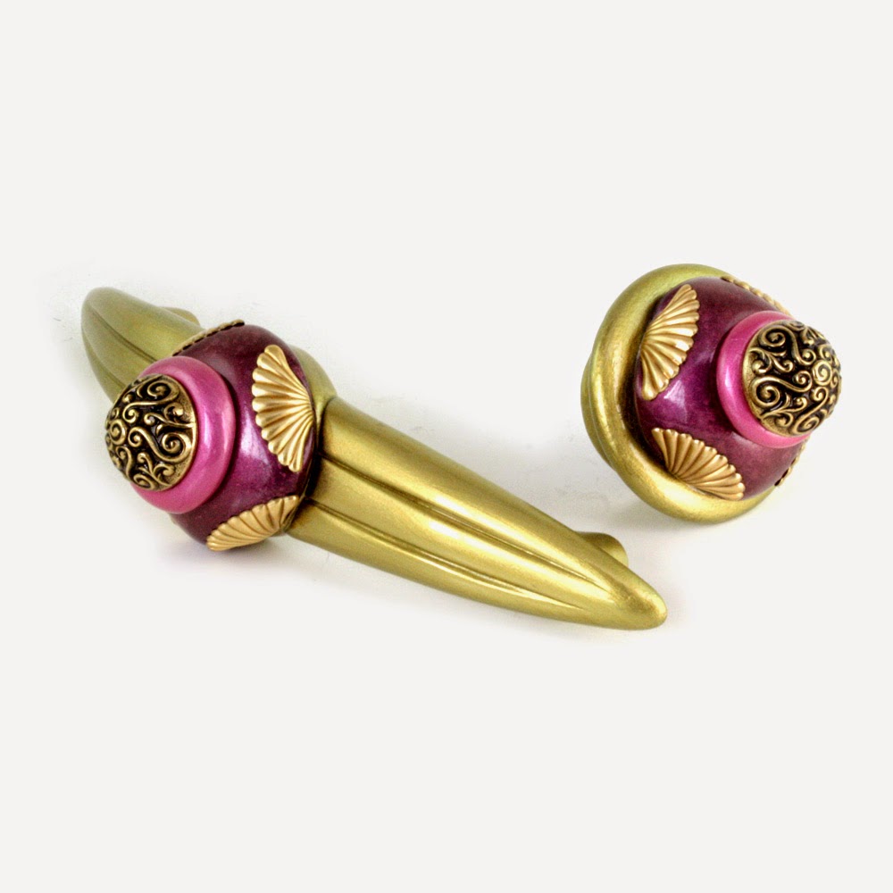
Add the presence of a bronze green or pearly white as we did in these square knob prototypes. Both color combos are popular and easily integrated into interior decorating themes.
Cherry wood with a reddish stain, white cabinetry, or even black would be a fantastic backdrop for these little treasures. Gold metal details and smoke topaz crystals are a pretty sweet accent with wood flooring.


The 36" Aurora mirror frame is a display of our jewel tone ruby and agate brown paint treatment. The illusion of the two colors side by side fools the eye to read a marsala red.


In keeping with the theme of our jewel-tone names, our marsala hue will be coined light  garnet. Hardly a "quiet" red, this is bound to be a big color for our line in 2015.


Sunday, November 30, 2014

Pink -- When It's Hot, It's Hot!


So easily associated with little girls, valentines and summer wardrobe, pink can take on a whole different persona when it comes to decorating.
It probably had it's heyday in the art deco period when pink and black tiles were the fashion for bathrooms.


The color also had a huge presence in mid century modern furnishings. My childhood memories bring up recollections of our living room where the focus was a pair of glamorous club chairs. They were covered in a pale pink leather outlined with nail head details and paired with a couch in a handsome gray tweed. Wish I had a photo! But nevertheless I resurrected the color scheme in the paint finish for our Posh Pam lamp with a silk shade in a vibrant blush.


A few years back  I was determined to create a new and  uncommon color scheme for the High Point Furniture Show. We showed up at market with our Neapolitan collection that included a Diva armoire and Rumba end table painted in a rosy pink and brown motif .

To complete the vinette we also introduced our Rockin Rose lamp. The shade was a modern hardback drum shape covered with a brown poly blended fabric. I had it lined and trimmed with the same fabric in dusty pink. When the lamp was turned on the glow was an awesome cinnamon.red.


For the moment I'm on a mission to find a spot for hot pink in our collections and exploring new ways to use it n our hardware. For the start, I'm loving it with bronze green, amethyst purple and gold. Where it leads me...we'll just have to see.

Thursday, November 20, 2014

Hand Painting - It Gets Personal

I was reminded recently of how I came up with our Tiki designs. Originally created to mimic tortoise shell shapes and colors inspired by the tortie coat of  my Persian cat Lucy, I never expected it to become one of our most popular lines.  I've watched it morph over the years as each artist in my workshop put in their own personal interpretation of "Tiki". Just like handwriting, each Tiki knob and finial adopted a signature look.

Tiki Banister Ball has a magnificent blend of  black  butterscotch and gold just like my  Persian cat Lucy, 
.Then we even started to create the pattern in colors far removed  from the original tortoise pattern. Purples, blues, reds and most recently pink and blue. I almost forgot there was a Polynesian impetus behind my original invention.
If the Tikis are little works of art, the big personal artistic expression is everywhere in our furniture collection. I especially enjoy the freedom my artists have enjoyed with our scroll pattern and ribbon leaf motifs.  As part of our furniture painting training, each person is instructed on how to create the pattern with some "must have"parameters and some loose guidelines. It's probably derived from my art teacher background, but I always allow them to choose the brushes and tools that feel the most comfortable. Then I encourage them to interpret the design. The results are magnificent! 

Not that it was my intention, our workshop artists have literally hailed from all over the globe. Unique cultures. backgrounds and aesthetics are all reflected in the brush stroke and the style of the individual artist.and it's given an exotic look to our hand painted furniture.


Scroll patterns from our Barcelona Beds
Painted by: Filipe from Portugal, Karen from China, Sonoko from Japan, Troy from Florida


Ribbon and Leaf Patterns / Jitterbug dresser, Diva Armoire and Charisma Bathroom Vanities
Painted by Bea from France,Filipe from Portugal, Sonoko from Japan


Sunday, November 2, 2014

Pizzazz in the Bathroom

Remember when bathroom sinks were either a free standing pedestal or a counter under mount? And hey weren't they all porcelain? The bathroom sink has come a long way in the past 10 years. Its metamorphosis has seen a variety of vessels available in a list of materials to make your head spin; glass, stainless, marble, bronze, wood, hammered metal and oh yes, porcelain still reigns.
Charisma Bathroom vanity with Oceana Vessel Sink 

Choosing a bathroom bowl can be a daunting challenge and there's no doubt we pull out all the punches for the powder room. Whether it be a residence, restaurant, hotel lobby or theater, nothing can be too showy or dramatic when it comes to the bathroom with this antiquated name. It's the kind of venue that offers utter decorating freedom where the designer can be the most daring with colors, textures, lighting and materials. In this instance our customer selected our Nu Mini Style 11 knob that we customized to highlight the prominent colors of this one-of-a-kind hand crafted sink. She shot photos before and after the cabinets were finished in green.  I like them both.

Friday, September 19, 2014

Designer Kitchen Pulls It All Together


It was a feature in a 1993 Spring Market issue of Interior Design Magazine that made our cabinet knobs known throughout the home furnishings industry. I'm often reminded how important interior designers are to our business. Professional, creative and risk taking, I love the way they approach their projects, particularly attentive to the little details that make a big statement.

Some interior designers have an incredible flair for putting together unusual color schemes. A perfect example is this Alexandria Louisiana custom kitchen designed by Kyle Downs. She picked out an awesome mosaic tile Oceanside Glass Meredian in a palette that combines iridescent aqua and canary gold with candy apple red. A complementary Vibrato pattern is used in the adjoining utility room and wine pantry.


We created a knob and handle with the focus on the blue and gold to contrast against the white cabinet faces and I just love the way the red crystals add a little extra pop of color.

I'm excited to see the whole thing come together with the glass switch covers that we made up in a custom red paint finish. To be continued for sure...

Tuesday, August 19, 2014

Portraits of a Nu Lily Knob

Many people don't realize what it means for us to customize a knob to match your decor. It's really unnecessary to alter the structure or architecture of the knob, when color plays an integral part of the design.

In our case the composition of each knob offers a resin, metal and crystal color.This presents a lot of variables,each one just as pretty as the other. Just like tweezing an eyebrow- each little tweak offers a significant change to the look, feel and even the style of the knob.
Nu Lily knob 1.5 In.diameter with crystalNu Lily knob 1.5 in. diameter with crystal

Nu lily 1.5 in.diameter knob in periwinkle and amethyst crystal


I'm not surprised that Interior Designers have always been partial to our Nu Lily knob, maybe due to its versatile 1.5" diameter size and the intricacy of the design.
Nu Lily knob 1.5 in. diameter in opal and light gold with topaz crystalNu Lily Knob 1.5 in. diameter in lilac with crystal

I love the way  the delicate crystal offers just the right measure of shimmer and color. And I'm always amazed at how different metal colors affect the decorative tone of the knob.
Nu lily kno 1.5 in.diameter in periwinkle and pinkNu lily knob 1.5 in.diameter in emerald green with amethyst crystal
Silver metal treatments tend to make the knob look more modern or contemporary. While the gold metal details offer a more traditional feel to the color scheme.


Nu lily knob 1.5 in. diameter in turquoise teal with crystalNu lily kno 1.5 in. diameter in alabaster white with crystal.


 As much as I enjoy seeing the Nu Lily in so many fashionable color combinations, I have to admit it has just as much charm dressed in all white.


Thursday, August 14, 2014

Oldies but Goodies - Decorative Hardware from our Archives

Orbit Grand Tiki pulls in gold, black and periwinkle.

You can just imagine how many knobs and pulls we've created over the course of 20 years and occasionally we get a request for an item, that well -  we just haven't seen for awhile. A customer may be looking to match a knob they purchased a while ago, or one of our retailers may ask for a knob on their Susan Goldstick display that hasn't been updated. Most typically we get a request from someone who spotted a knob or handle in one of our printed catalogs that we used to publish regularly.
We  referred to the mini style 7 knob as our M & M knob.

 There are many different reasons why a manufacturer my retire a product - out of style, discontinued parts, not profitable, too difficult to produce and sometimes it may just compete with another product. Regardless, we try to oblige these requests whenever possible. I have to admit  it's kind of fun seeing these designs emerge from the workshop. It motivates me to  revisit some of the knobs and pulls from the archives and contemplate whether I should bring back a favorite from yesterday and turn an oldie into a newbie.
The nu duo  has one of my favorite colors schemes.
We called them "show stoppers " Parfum knobs have  2.5"projections.  

Wednesday, August 6, 2014

Color it yours! Custom Paint Finishes for Glass Switch Covers is our Specialty

Double glass switch plate has custom paint finish created to match mosaic glass tile.
There's a bounty of beautiful glass tiles in the marketplace today that have fast become the most popular design choices for both kitchens and bathrooms. Recently I attended the opening of an exquisite new showroom in San Francisco's design district and was blown away by their selection. Art Deco, mid century modern, urban, eclectic - wow -there's a glass tile style to satisfy every decor genre. It's a magnificent statement worthy of an elegant detail. And you guessed it, this is where glass switch covers are a natural fit.

I'm particularly fascinated with the mosaic designs because they pose so many color options. We offer 15 choices from our jewel- tone palette covering a broad spectrum of colors that range from the soft pale hues to the deep and bold.
Jewel Tone Glass Color Palette
But as one may suspect there's always going to be a situation where we just don't have the right match. This is when the request for custom colors comes into play. I like the challenge because it's exciting to invent a new hue and we're pretty confident that we can come up with the right mix. To get the process started, we'll ask  our customers to send us their sample tile, or sometimes even a photo will do. Of course they should realize that custom colors may incur an up charge for the special service.

Sunday, July 13, 2014

Soft Color Palettes Soothe and Stimulate

Decorating with tints of color and touches of white has a special allure. Offering calm, serenity  and yet nothing less than drama, it's easy to understand how people gravitate to these color schemes. Not limited to pastel hues, the design motif can also include a pop of bold color amid shades of gray, white and earthy taupe.
I perused our library of product images and was amazed at how many beautiful creations that we developed for our interior designer clientele over the years.I found some wonderful examples of knobs, pulls, drapery hardware, switch plates and furnishings. Some sophisticated, some whimsical, some simplistic - all excellent applications of soft color palettes, these are some of my favorites.

Nu Lily Knobs adorn cabinetry and complement wall covering. Photo courtesy of Vanessa Deleon Associates Interior Design.

Close up of Nu lily cabinet knob combines light sapphire blue with deep opal gray and Swarovski crystal.

Jitterbug cabinet dresser with cabriole legs has paint unique paint finishes using warm light gold, jade green and amber brown.

Jumbo Birdie Drapery hardware combines gold paint finishes with alabaster white and Swarovski crystal has always been one of our best selling window decor sets.

Corner and finial detail from Barcelona dresser shows unique artwork in a sophisticated color scheme combining pastel tones of lilac and shell pink with light teal and deep opal gray.

Birdie drapery hardware set combines silver with shell lilac and periwinkle purple with Swarovski crystals.

Combination duplex outlet and single toggle switch cover combines pale blush and silver paint finish with Swarovski crystal.

Erte Tieback has soft blend of pale blush and gold with drape and belt in various shades of mauve.

                                    Eel Ivory  knob and Drawer Pull in cast and sculpted resin in alabaster with gold and just a hint of black with  Swarovski crystal. 
Custom duo knob 2" was designed to match kitchen glass tiles and has a matching pull.